

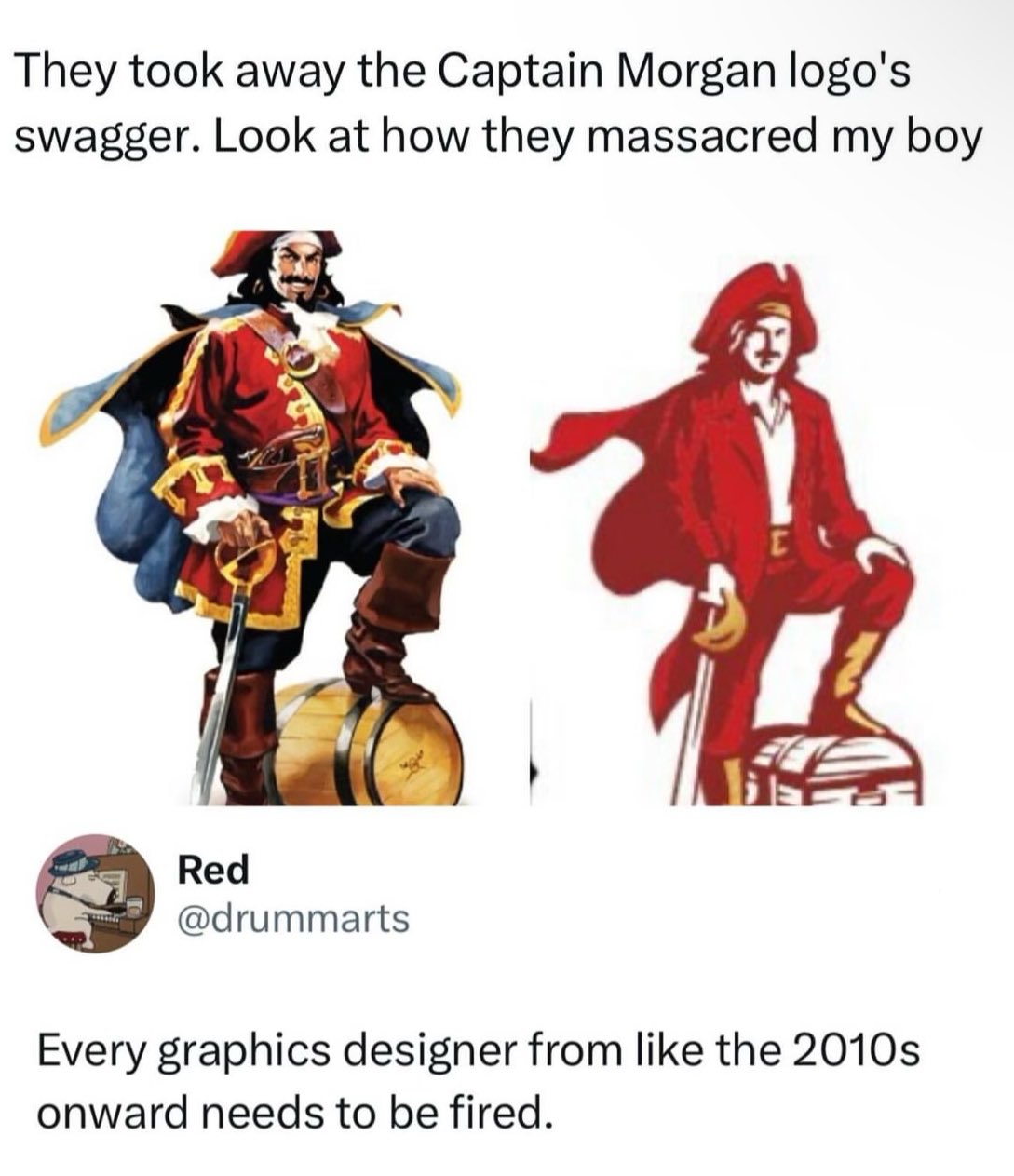
Why did they replace the barrel with a chest? Come on guys, this isn’t hard. The barrel is rum, the rum is the treasure. Smh
And why the fuck is he wearing a suit?
I think it clearly pictures the company CEO’s values. The suits and their chest full of profit money they want to keep all to themselves.
Or maybe the people buying this rum see themselves as successful business men who are buying this run because they have so much treasure.
😂 successful business men aren’t buying Captain Morgan
I’m so confused by the reaction to my comment. Do people think I said this rum was for successful business men? Or what I actually said that they see themselves that way.
I understand what you’re saying. I think you can interpret what you said in two ways that sound like you don’t know captain morgan: either you think actual successful businessmen drink it or you think people who aren’t successful but ignorantly think of themselves as successful drink it.
I think you’re getting downvotes because both of those groups wouldn’t drink captain morgan as a “sign of their success”
For example:
For people who aren’t aware, Henry Morgan was a legendary pirate who used his pirate booty to purchase sugar plantations in Jamaica to produce rum. Eventually he became so wealthy and famous that he was appointed the Colonial Governor of Jamaica.
He wasn’t a 20-something guy in a nightclub with a popped collar.
And I’m sure there was nothing going on there but well paying jobs for the local inhabitants. What a cool guy.
Oh yeah no, the dude was a slave owner and a piece of shit. Let’s also not forget what a pirate literally is. He was not a good dude. But he was famous and was subjectively kinda a badass in a historically contextualized perspective.
To be fair, he’s now basically a cartoon character who is used to promote the sale of cheap flavored rum. So…
Ok I’m in a waiting room super bored so forgive my ridiculous takes, but the second one is probably a better logo even if the design is worse in a bunch of ways.
So, first lets look at Morgan as a brand. It’s a known brand, but not exactly top shelf stuff. From what I can find, they seem to be trying to change that, moving into the ready-to-drink and doing a bunch of social media stuff. they’ve moved from using artificial vanilla flavor to real *Madagascar vanilla* which is definitely more marketable no matter if it actually tastes better or not.
So as part of that they’ve redesigned basically all their labels and that means they need vibe with the modern upmarket design trends which right now are to use more type and negative space, and to ape design from the era around the 50s and maybe 60s. It goes with the current retro packaging design trend but doesn’t alienate older people like the 70s based stuff, which is usually aimed at a younger market segment. It’s old enough to feel “classy” even if the customer is old.
As part of that, the large illustration doesn’t fit. Printing full color like that in the era it’s aping was expensive so it feels out of place, and you just don’t have space for it if you want a clean look. So it’s got to be way smaller. The old label has the illustration as basically the main focal point - it’s huge. The new one has it as a small design point. The illustration just doesn’t work at that size. On a little 50ml bottle it’s going to be like 4mm high. Here’s a photo I found.
The new one actually reads pretty similar even though it’s like half as tall and only uses 2 colors. When it’s on a bottle that small and sitting next to Admiral Nelson and Lady Bligh which still use big full color illustratons on their labels can you tell which one is which?
But here’s the thing, the captain isn’t even actually the logo. The logo is the name, it’s the same logotype. They didn’t change that. They changed the mascot. It’s pretty important to note that there’s a big difference. A logo basically is your branding. It needs to work at any size, in any medium, and be instantly recognizable. That generally means it needs to be pretty simple. The Morgan logotype works great as a logo, but the mascot until now really didn’t. You can tell because if you look around there are about 50 different versions because the big full color illustration doesn’t work more often than it does. The new one will.
With all that defense I will say there are a few kind of dumb moves. The treasure chest is clearly a terrible idea. Like, if they were swapping it in on the non-alcoholic lines it would be kind of great but on everything it’s dumb. And I definitely would have fought for a puffy shirt instead of the collared one, if nothing else than for historical accuracy - I don’t think you can even wear shirts if the era unbuttoned with a collar like that. Edit- honestly they might be going intentionally anachronistic so that you can “cosplay” as the captain easily. Do the pose, hard cut to the captain logo, it writes itself. Which would be kind of clever but if that were the case I might have pushed the whole thing to be slightly more androgynous.
Anyway, I keep seeing this take over and over again, that everything is moving to minimalist blobs for logos, and while sometimes there’s definitely a point (the cross branding for Google’s apps on Android come to mind) a lot of the time there done just like this - with two large copies next to each other. And when you frame it like that of course the detailed one will look better. But when your logo has to shrink to 32x32px on a crappy Android phone or be printed like 5mm wide in black and white the simpler one is going to look way better.
Anyway thanks for coming to my Ted talk I guess.
Tldr: the guy isn’t the logo he’s the mascot and the new one can be printed small.
This is all true. But he still looks like David Arquette instead of Dustin Hoffman’s Hook. They could have retained his swagger even with a simplified look.
I really dislike the collar shirt. I, too, suspect cosplay encouragement, but it really ruins the scallywag vibe
It’s the shitty contagion of Flat design. Back around 10 years ago or so, the Flat craze began and everything that had details or depth was pounded down into simple flat design. Now everything has to look basic and boring, and it sucks.
I really like the simplicity of flat design. It makes things easier to find and recognize, especially for icons. Also easier for people with poor eyesight. It caught on for a reason.
Lemmy loves to shit on designers but there’s no way the designer had the autonomy to come up with this on their own. 100% guaranteed this idea came from marketing or an executive.
I don’t like flat design because it’s basic, boring, and sad. Windows 10 and 8 were ugly flat boring UIs for example. IMO peak GUI design was Mac OS X 10.6 like this:

Full skeuomorphism out the ass