• 0 Posts
  • 58 Comments
Joined 1 year ago
cake
Cake day: June 30th, 2023

help-circle


  • Not to mention that even if you personally managed to switch to something else, if you’re not doing some completely solo work, you will still receive files from others (or may be expected to send files to others) in Adobe format. So even if you wouldn’t be using it, you’d still have to pay for it to stay competitive. At which point you may as well use it because of what you said, that most of the alternatives are missing those expert features. So in professional setting, there’s unfortunately no escaping Adobe. Someone would have to come up with an alternative feature full package of apps covering all bases (because Adobe isn’t just Photoshop and not just graphic design but an entire interwoven ecosystem used in various related fields) and then work really, really hard to push the industry toward it. And it would still probably take a decade or two. So realistically, it would have to be or become some big corporation that would likely turn evil too as the time goes. Or some open source miracle like Blender that would have to attract enough big sponsors.

    Not defending Adobe, just saying how it is. I have enough grievances about their software (how they managed to fuck up something as simple as Acrobat is beyond me) but you just have to deal with it or look for a job in another field. (I’m lucky enough that Adobe is only secondary software for me but even then I still can’t escape it.)


  • It’s still a terrible metric to compare the safety of modes of transport and the Wiki article just below the table explains it well:

    The first two statistics are computed for typical travels by their respective forms of transport, so they cannot be used directly to compare risks related to different forms of transport in a particular travel “from A to B”. For example, these statistics suggest that a typical flight from Los Angeles to New York would carry a larger risk factor than a typical car travel from home to office. However, car travel from Los Angeles to New York would not be typical; that journey would be as long as several dozen typical car travels, and thus the associated risk would be larger as well. Because the journey would take a much longer time, the overall risk associated with making this journey by car would be higher than making the same journey by air, even if each individual hour of car travel is less risky than each hour of flight.

    If people made similar trips with cars as they do with airplanes, cars would lose in the per journey metric big time.


  • I think I get what the guy is trying to say. Per journey, air travel might indeed end up being statistically less safe (how many times a year an average person flies vs. how many times they drive their car) but of course the question is whether that particular metric is any useful. Surely if you replaced all airplane trips with car trips, more people would die.

    This Wikipedia article contains a table, which if true, confirms it:

    https://en.wikipedia.org/wiki/Aviation_safety#Transport_comparisons

    If you sort it by Journeys, you’ll find that 117 people die in an airplane per billion journeys, while only 40 die per billion car journeys. But the article points out exactly what I said before.

    Funny example that illustrates how important the choice of metric is, is the Space Shuttle which is statistically incredibly unsafe per journey (17,000,000 deaths per billion journeys) and even per hours (only skydiving coming first by a small margin) but is safer than bicycles and only twice less safe than cars per distance traveled because of those insane distances it covers in orbit.

    Edit: Not that I do not know whether the table counts only commercial flights or all airplane/helicopter journeys. And also the statistics is pretty old (1990-2000) and only covers the UK, so you may still be right and commercial air travel in the last decade might be safer per journey than cars globally. Can’t find a better statistics.


  • I honestly don’t understand why anyone would refuse to switch from away Chrome. It’s not like the other browsers lack functionality or are slow. The only problem they might encounter is some rare incompatibility which is the result of Firefox (and its forks) small market share and web devs not caring enough.

    I’ve never used Chrome as my primary browser and I don’t think I missed anything. I started using Opera years before Chrome was even a thing (back when everyone was using IE) and then when the old Opera died, I didn’t think even for a second about switching to Chrome and went straight to Firefox. Which could at least be highly customized to bring some Opera exclusive features (eg. mouse gestures, tab grouping) back.


  • To be fair, let’s be glad that 80% of people don’t use an ad block. If it were the opposite and 80% did use ad block, web services would be much more aggressive in combating ad blockers and many more of them would end up pay-walled (although it seems we’re heading there anyway).

    On one hand, I feel kinda bad that my ad-free experience is only supported thanks to those who do undergo the torture of ads, on the other hand, the companies have only themselves to blame. If web ads were decent, only limited to sides and headers or even between paragraphs of web pages and didn’t cover the content you’re trying to view, didn’t try to trick you into thinking it’s part of the content, didn’t lead to malicious websites, didn’t autoplay videos with sound or didn’t put unskippable ads before and inside videos, I would have never felt the need to install an ad block.


  • Dude, what the hell you’re onto?

    1280 x 800 is 16:10

    That’s exact.

    1280 x 720 is 16:9

    Also exact.

    1280 x 768 is also 16:10.

    In the link you provided, it literally says it’s 5:3. It even has its own line in the infographics. And while the article is titled “List of common resolutions”, it looks more like an exhaustive list of almost any resolution that has been ever used in any kind of consumer device. It’s definitely not limited just to standard computer monitors so that table isn’t really that relevant to the topic of the discussion.

    Also show me a monitor with the 1280 x 768 resolution that’s currently available on sale.

    You’re picking up some extremely rare cases to make an argument that your initial statement about “usually different aspect ratio” was correct but that’s not how it works. That’s just moving goalposts.


  • Nah there are more

    5:4, 8:5, 21:9, 64:27. And more

    I already mentioned 5:4 and 8:5 equals 16:10.
    21:9 and 64:27 are just ultrawide formats which I also mentioned and you can’t really mistake those for 16:9, can you? Same goes for 5:4 and 4:3 which are rather square-ish (4:3 was typical for old CRT monitors and TVs).

    And these aren’t exact. There’s fault tolerance, so to speak.

    I don’t think “fault tolerance” means what you think it means.

    You can have slightly different sizes rectangles between several different 16:9 monitors.

    Are you telling me that there are monitors that don’t have square pixels? Or that the number of (square) pixels doesn’t give an exact 16:9 ratio?

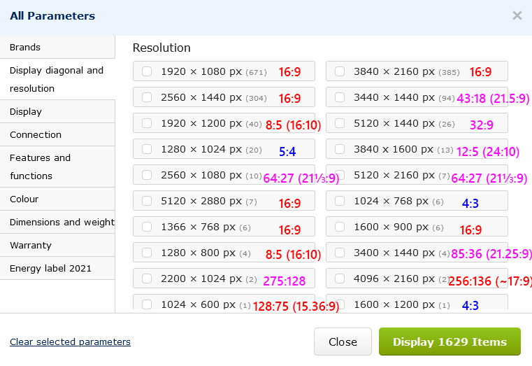
    Anyway, yes, there are more aspect ratios out there but the important thing is how common they are. I just looked at the biggest local e-shop and if I try to filter parameters by resolution, I get this:

    The number in the parenthesis next to the resolution is the number of products. (Note that this is only showing 1609 out of the total 1629 items - if I scroll down, there are 20 other options which all have 1 product each so I took the liberty to ignore those as those are ultra rare items (and some of them aren’t even regular monitors but just some specialized displays. Even here, for example the 2200×1024px is an e-ink touch screen)).

    I simplified each ratio to the simplest form, so those are exact ratios (but for some added a ratio with X:9 or X:10 in the denominator in parenthesis for easier comparison to those more standard formats). Turns out that 1379 out of 1609 monitors are exactly 16:9, so that’s 85.7%. The biggest variety are among the ultrawides which I colored in purple but again, those are pretty much unmistakable. Just like the 5:4 and 4:3 in blue.
    So realistically you have to watch out for the red ratios where 1379 out of 1426 are 16:9, that’s 96.7%.
    So I really wonder how you came to the conclusion that “monitors are usually a different aspect ratio to a TV”.
    Now of course one e-shop isn’t a completely representative sample but I hope we can agree that the numbers will be in the right ballpark. Feel free to make your own statistics from a different source.

    fault tolerance